Oracle Pipeline
Designer
Modernising a legacy Oracle JET application — without breaking what developers had already built.
The application had been running on an outdated Oracle JET theme for years. Visually inconsistent, WCAG non-compliant, and misaligned with Oracle's Redwood Design System direction. The ask: migrate the entire UI to Redwood components while working within the constraints of an existing JET codebase and a live production team.

Three things broken.
All at once.
The interface looked dated and cluttered — built on an old Oracle JET theme that no longer matched the company's Redwood direction. Visual inconsistencies across screens created a fractured experience.
Navigation was confusing. Missing loading indicators meant users couldn't tell if the system was working. No validation messages meant errors appeared without explanation. Three core heuristics failing simultaneously.
Color contrast ratios below WCAG 2.1 minimum. Font sizes too small for low-vision users. Focus states missing for keyboard navigation. The application couldn't be used by a significant portion of its intended user base.
Before I opened Figma,
I opened Nielsen.
I reviewed every existing screen against Nielsen's 10 Heuristics. Three failure categories dominated.
Primary actions used three different button styles across the application. Form field labels were inconsistently positioned. Dropdown behaviours varied by screen. Users had to re-learn patterns on every page.
Users submitting pipeline configurations had no feedback that their action was processing. Long operations appeared frozen. Support tickets frequently reported "the system isn't responding" for processes that were running correctly — just silently.
Form errors appeared as generic messages after submission — never inline, never specific. Users submitted incorrect pipeline configurations repeatedly because they didn't know which field had failed or why.
Redwood components.
Every single one.
I worked exclusively in Figma using Oracle's official Redwood component library. No custom components unless Redwood didn't cover the use case. No visual deviations from Redwood spacing, colour tokens, or typography.
What Redwood gave us
- Consistent spacing and grid system across all 7 screen types
- Accessible colour tokens meeting WCAG 2.1 AA out of the box
- Pre-built focus states for keyboard navigation compliance
- Developer-ready components reducing handoff ambiguity
- Unified typography scale replacing 5 inconsistent font sizes
What we had to negotiate
- Legacy grid layouts didn't map cleanly to Redwood's grid system
- Some pipeline-specific components had no Redwood equivalent
- Oracle JET's component constraints limited certain layout options
- Close collaboration with developers required at every decision point
- Content reorganisation needed before Redwood could be applied
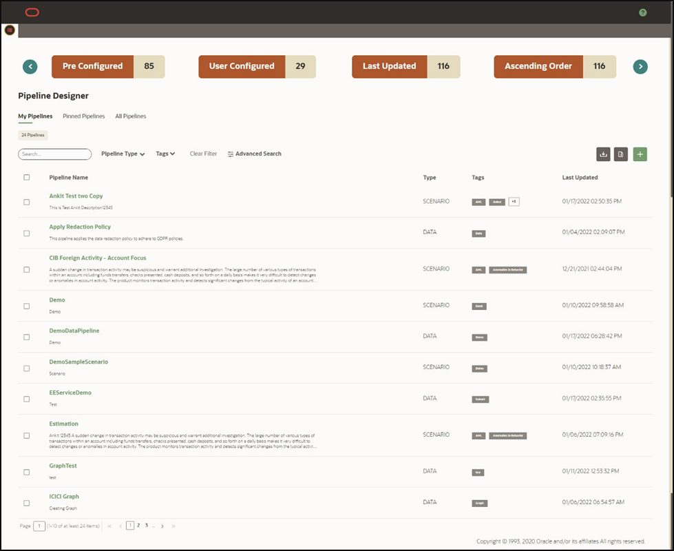
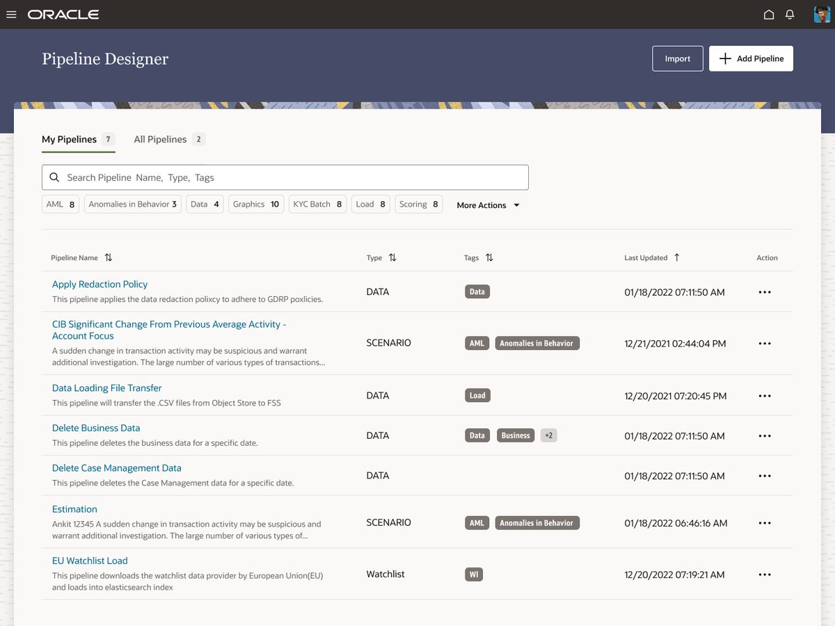
Before and after.
Seven screens.
Each screen went through the same process: audit against heuristics, identify violations, rebuild in Redwood, validate against WCAG. Here's what changed — and why.
The first screen users see. The old version buried actions in menus and showed all data at equal weight. The redesign surfaces status indicators, primary actions, and uses Redwood's table component with consistent sorting and filtering.
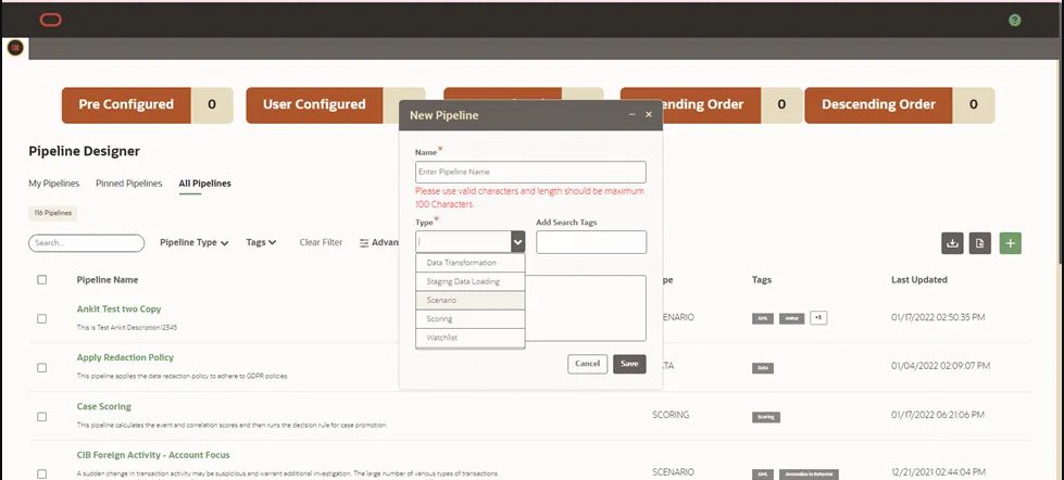
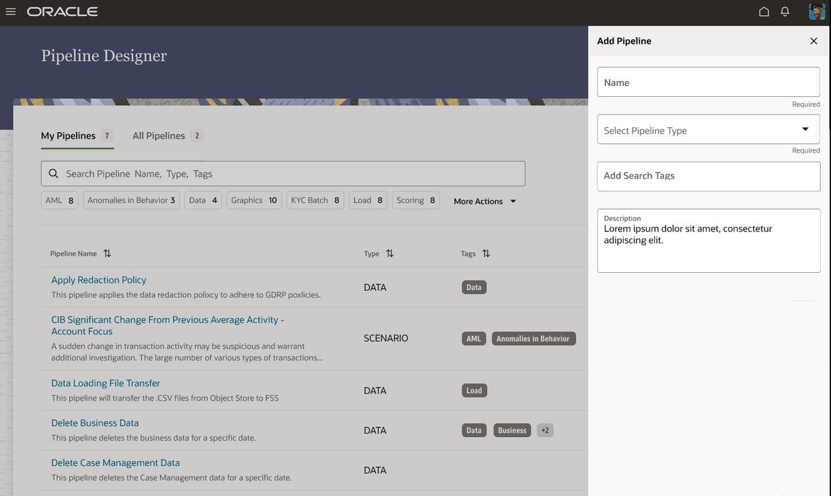
The pipeline creation form had no step indication — users couldn't tell how many fields remained or where they were in the process. The redesign adds stepped layout with progress indication, inline validation, and contextual help labels.
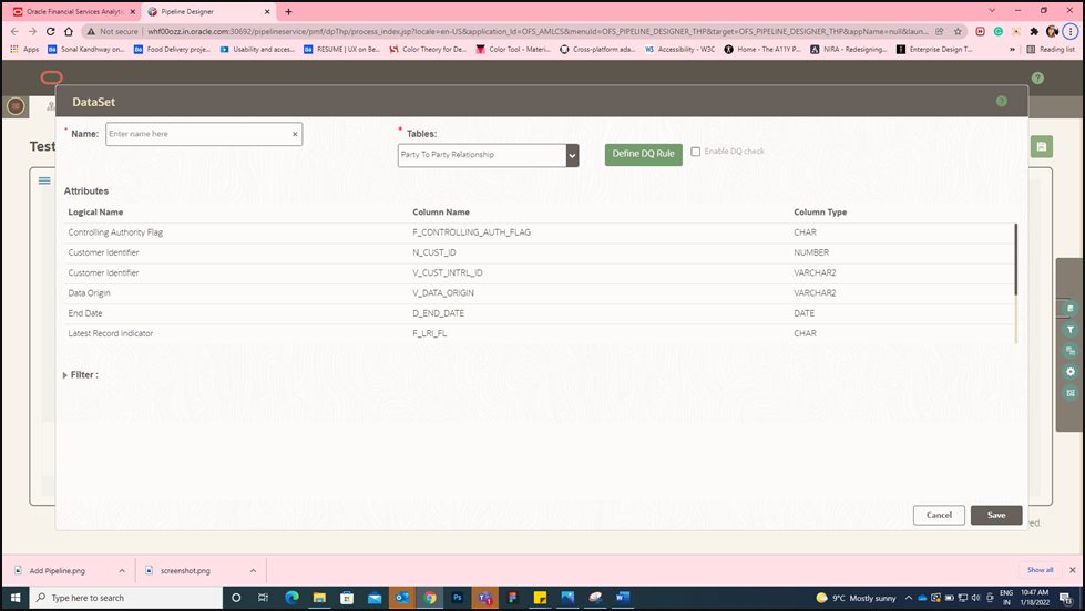
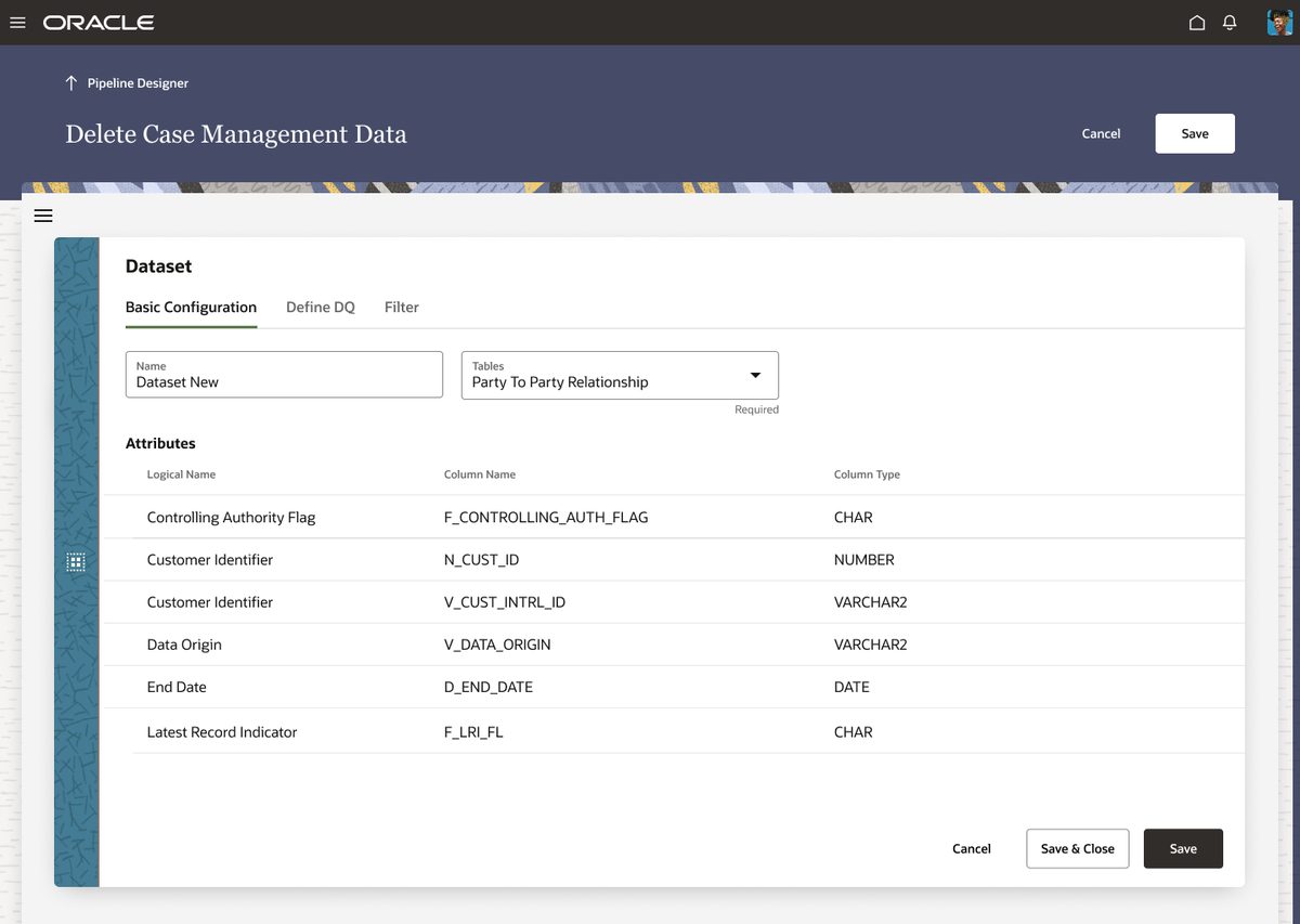
Dataset setup was dense and unclear. Configuration options competed for attention without visual hierarchy. The redesign organises settings into logical groups with Redwood's panel components and clear section headings.
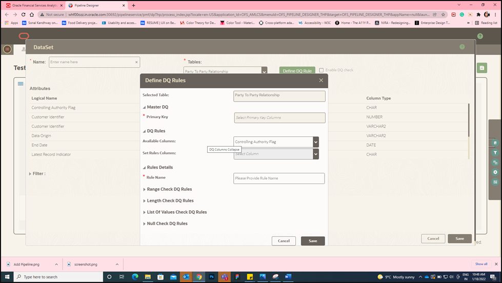
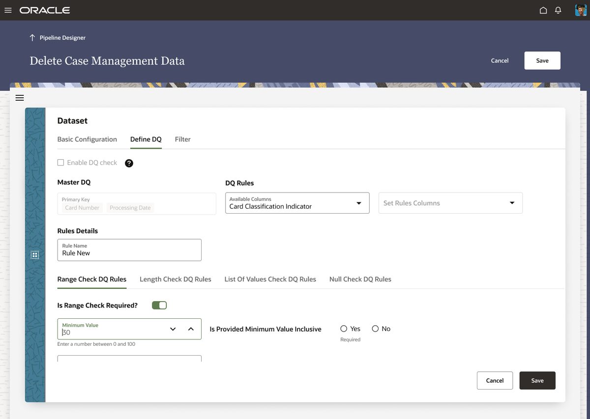
Data quality rule definition had no action hierarchy — critical rules sat alongside secondary options with equal visual weight. The redesign surfaces critical rules first, collapses secondary options, and adds inline validation feedback.
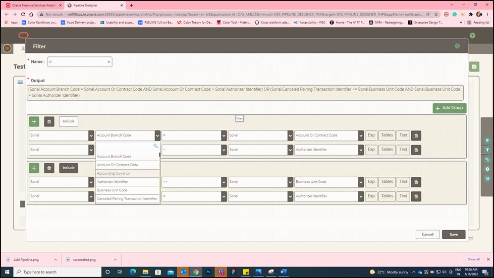
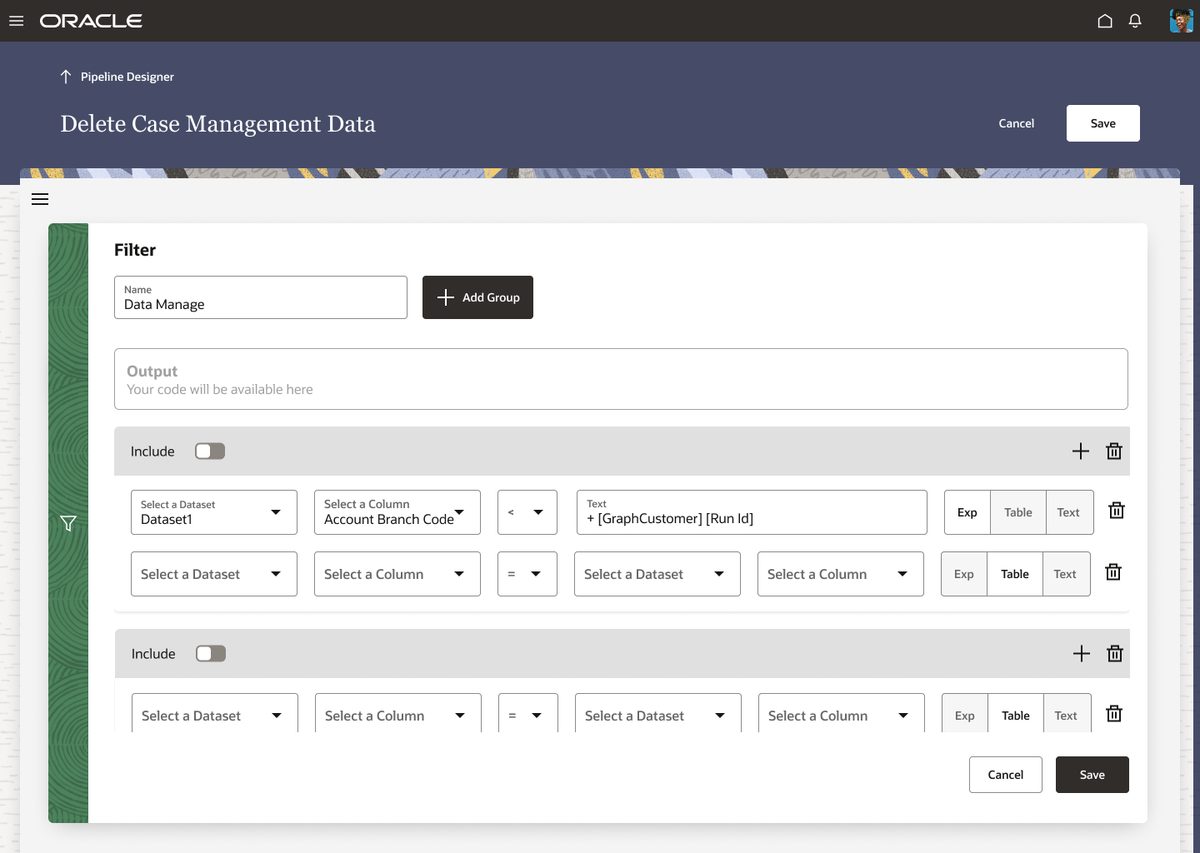
Filter controls were scattered and inconsistent — different filtering patterns on different screens. The redesign unifies all filter interactions using Redwood's standard filter components with consistent behaviour across the application.
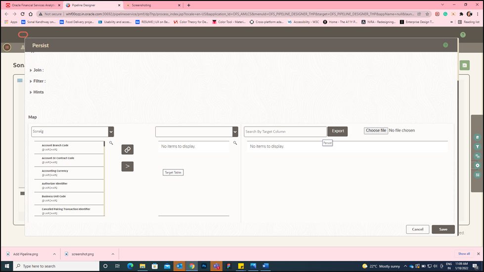
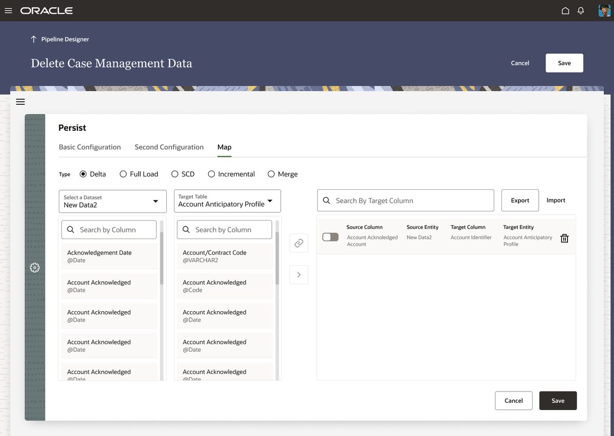
The persist step — where pipeline outputs are saved — lacked clear confirmation patterns. Users were unsure if their configuration was saved. The redesign adds explicit save states, confirmation feedback, and clear visual indicators of completion.
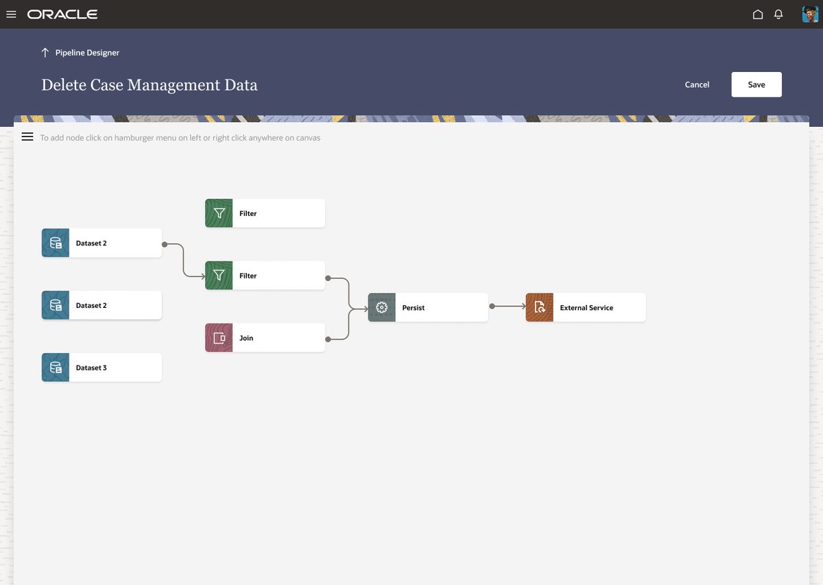
The canvas — where users visually construct data pipelines — was completely redesigned for spatial clarity. Redwood's canvas components replaced the old fixed-grid layout with a fluid workspace that scales with pipeline complexity.
The constraints were real.
Legacy layouts were built around an older grid that didn't fit Redwood's 12-column system. Direct migration would break the visual structure of every screen.
Redesigned the content hierarchy first, then applied Redwood's grid. Some screens required reorganising information before Redwood components could be applied meaningfully — not just a visual swap.
Oracle JET had functional limitations for certain components. Some Redwood patterns weren't achievable within the framework's current version constraints.
Paired closely with developers throughout the design phase. When a Redwood pattern wasn't implementable in JET, we found the nearest compliant alternative — maintaining the spirit of Redwood without creating unbuildable specs.
Modern. Accessible.
Consistent.
All colour combinations verified. Focus states visible. Font sizes meeting minimum requirements across all screen types.
100% Redwood components across all 7 screen types. No one-off custom elements. Developer handoff matched exactly to Oracle's component specifications.
All three critical heuristic failure categories addressed — consistency, system status visibility, and error prevention. Validated through stakeholder review and developer walkthrough.
Redesign was reviewed and accepted by the Oracle product team. No rework cycles after final presentation — the handoff went directly to development.
What I took away
- A pre-defined design system like Redwood speeds up delivery and enforces consistency — but only if you understand the system deeply first.
- Heuristic and accessibility checks at the audit stage save significant rework later. Problems found early cost a fraction of problems found at testing.
- Close collaboration with developers when working within system constraints isn't optional — it's the design process.